Why Green Is One of the Hardest Colors to Paint
When I was in college I had a professor who looked at a painting I was working on, and his only response was “Green in the hardest color to paint.” He was the type of guy to not really explain himself, so that comment stuck with me for a while. I wasn’t sure if that meant I was doing well or not, but as a result of that comment I’ve always tried to do right by the greens in my paintings.
Beyond being a funny anecdote I do think green is one of the hardest colors to paint. It’s easy to make it too saturated for the piece or to make it too washed out in an effort to do the opposite. When I decided to do the series inspired by Scottish landscapes I knew I would be working on pieces with a lot of green, so for each piece that featured green predominantly I made sure to be extra careful with choosing the right hue for that piece.
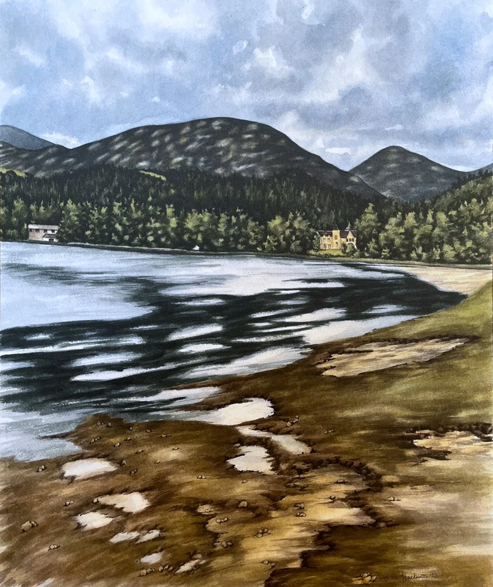
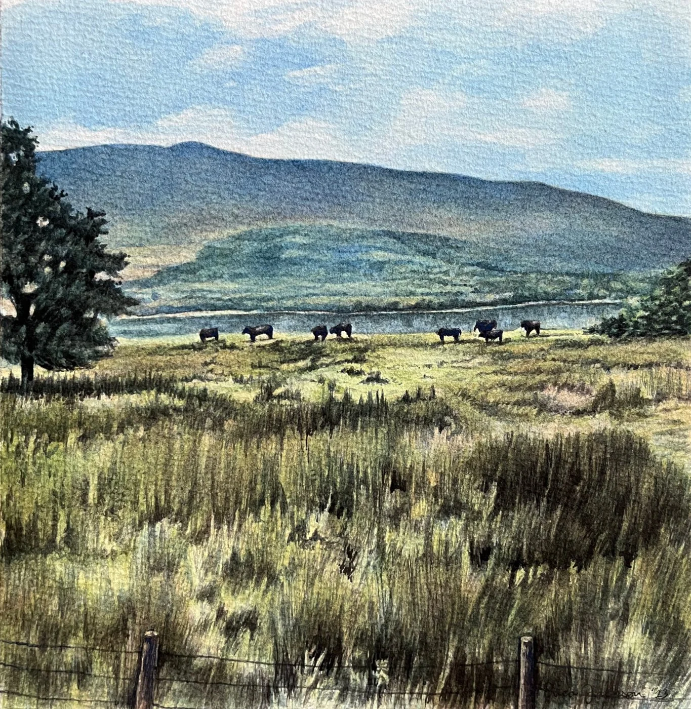
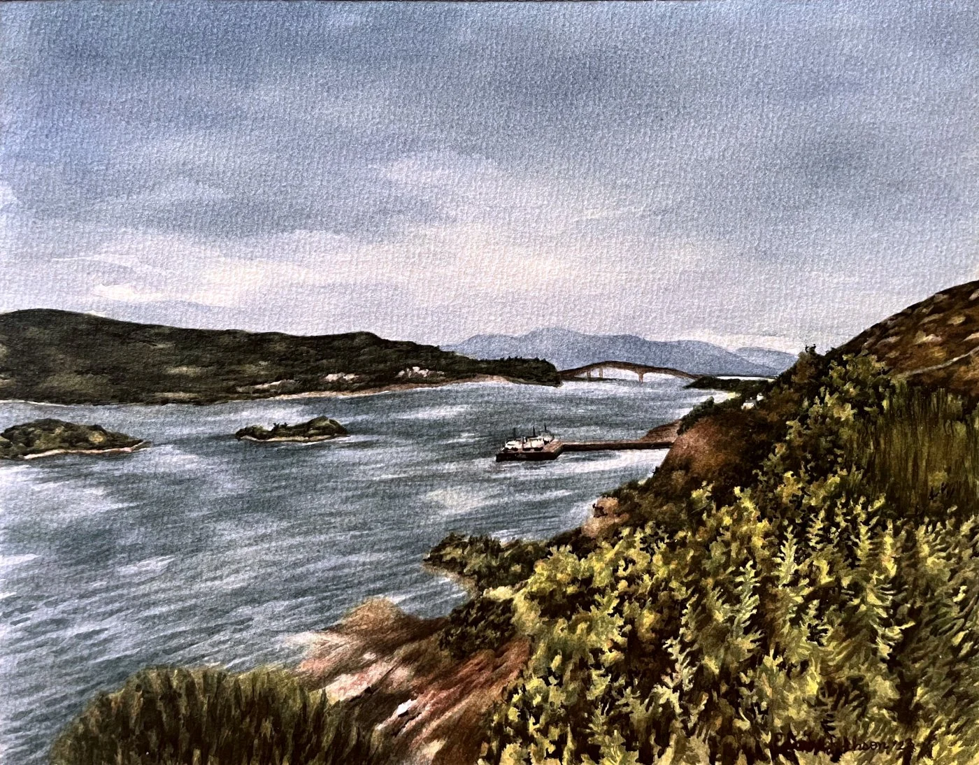
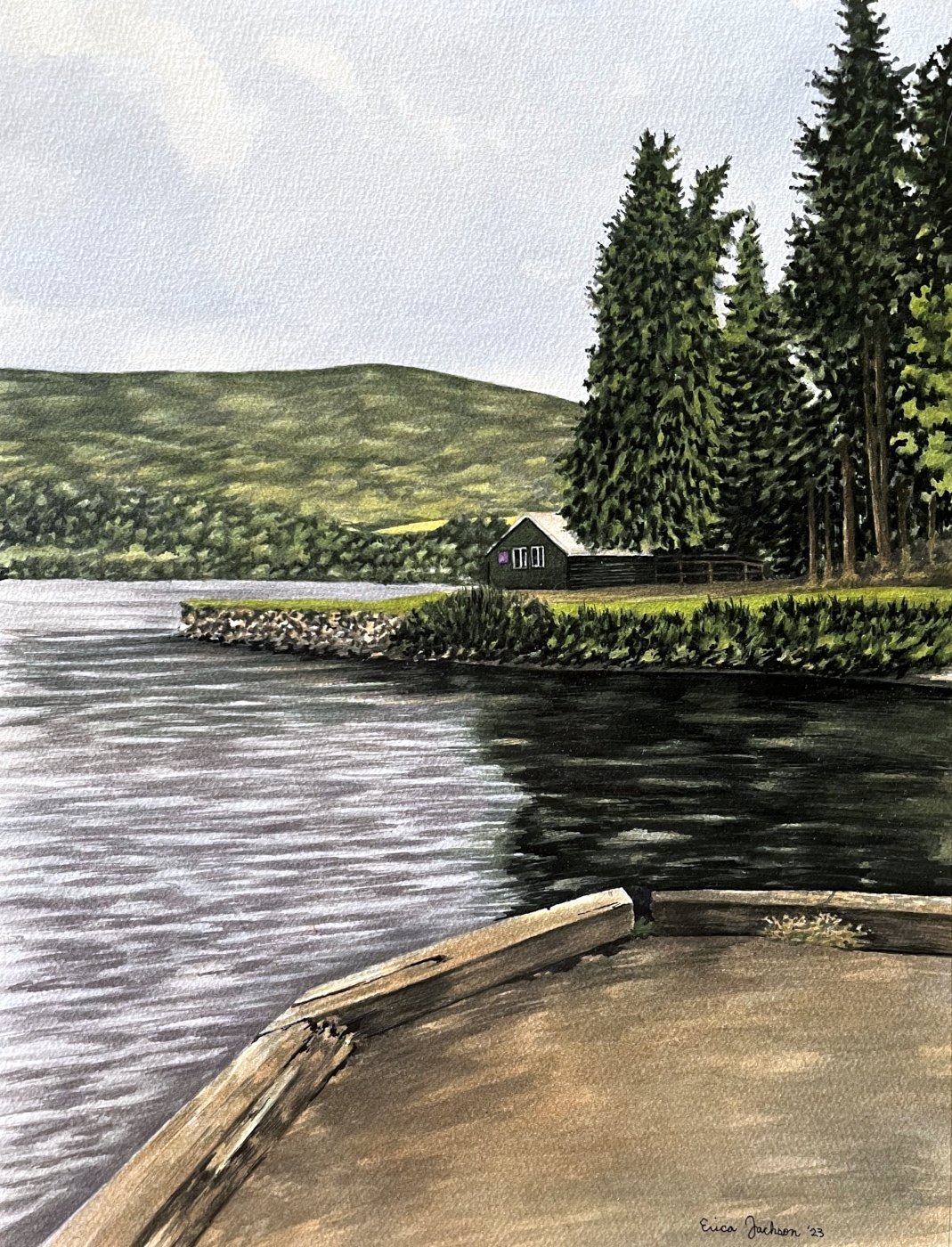
Because of the changing weather patterns in Scotland the colors become more muted, and therefore a lighter shade, either more blue or yellow in tone, ends up appearing most often, but when the sky is bright blue and the sun is shining you’re more likely to see a more saturated green with stronger yellow tones. Being able to discern the differences between the shades of green you’re seeing when creating a landscape painting helps be able to create something that more accurately reflects how nature looks in real life instead of something artificial.
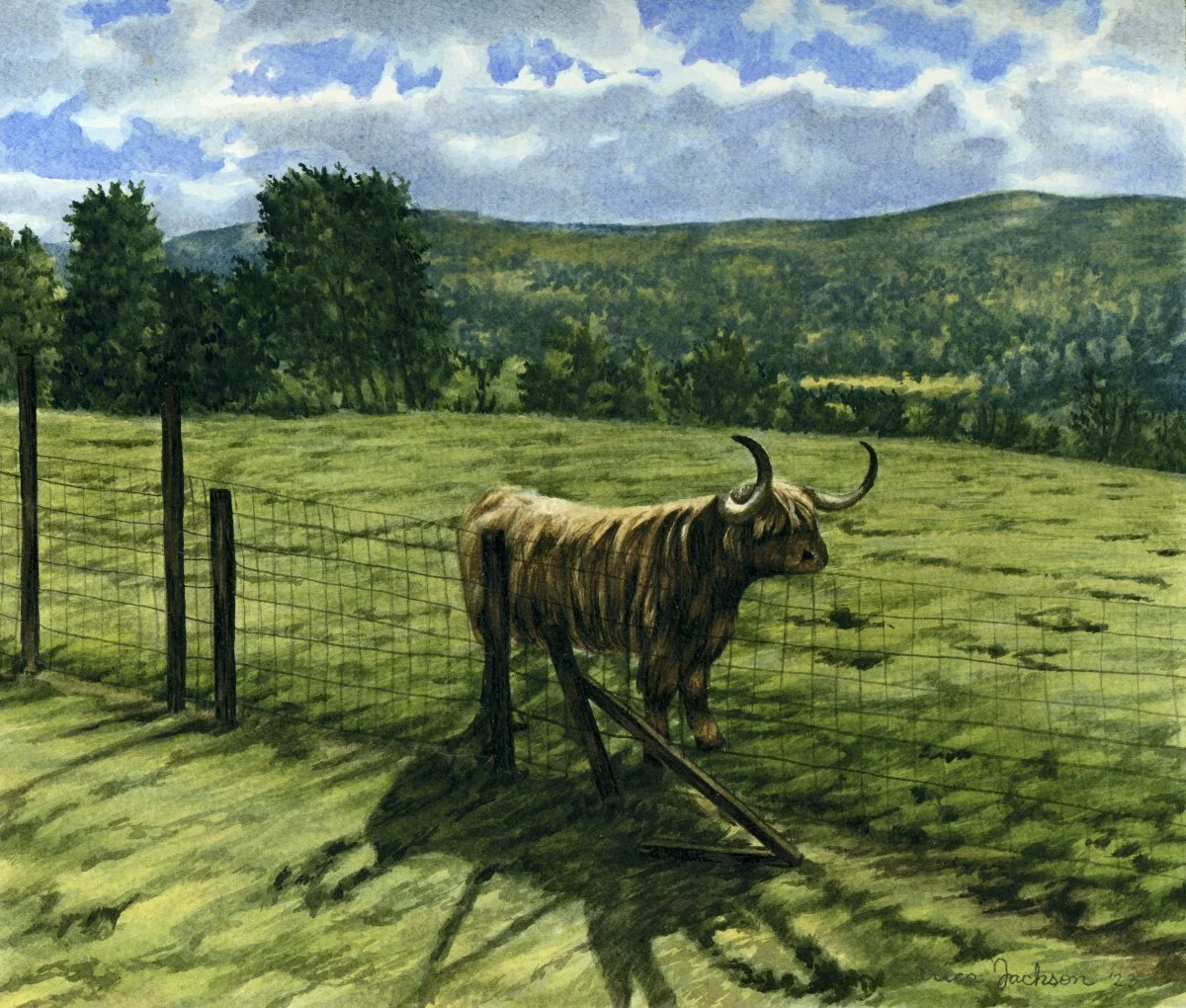
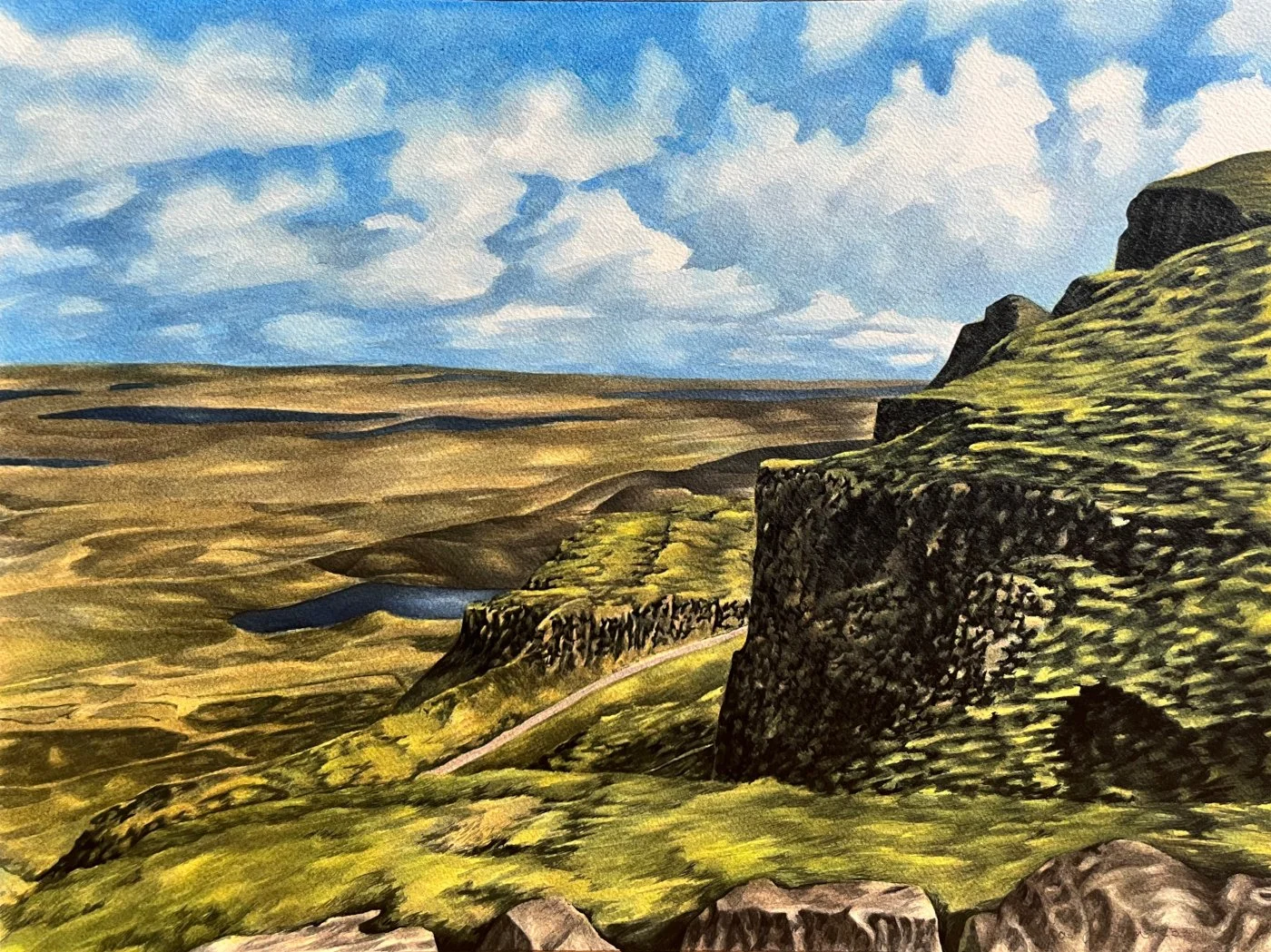
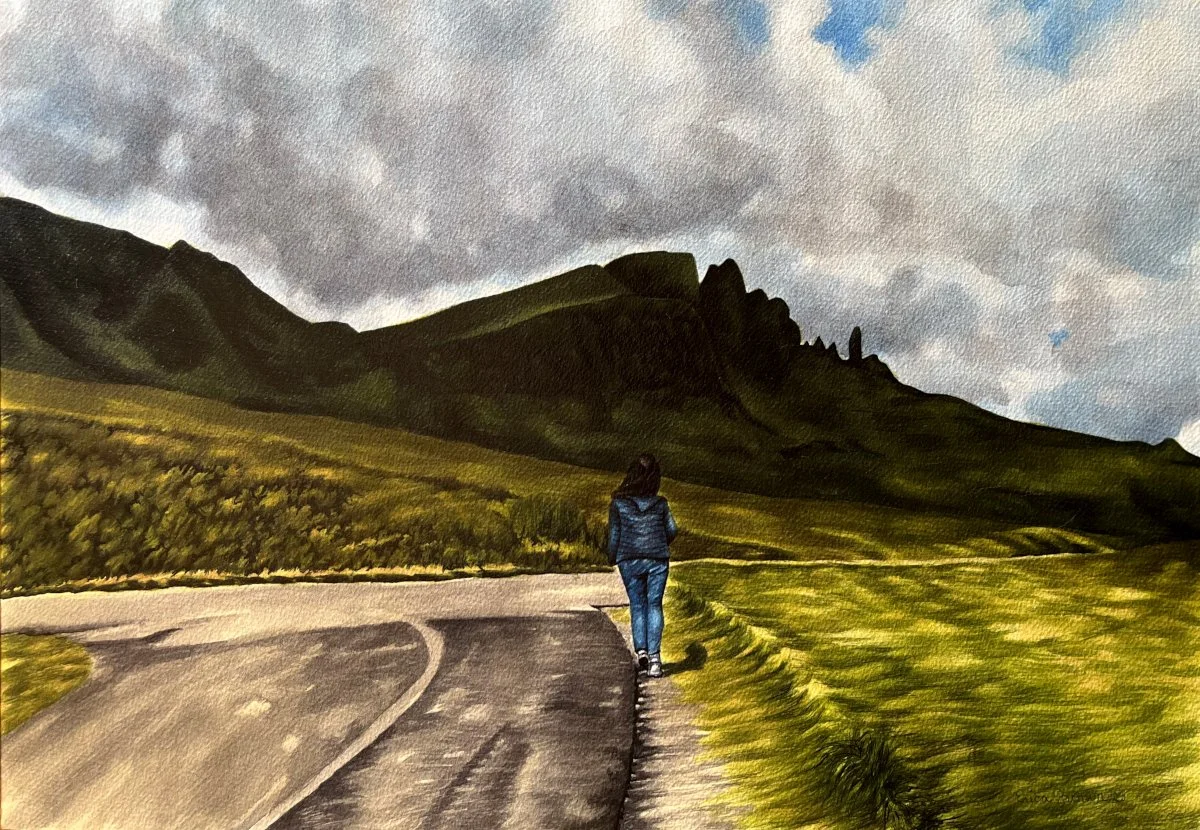
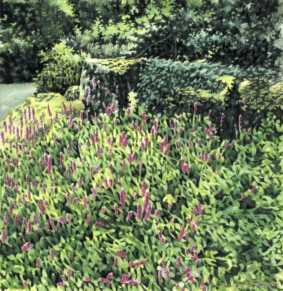
As I continue to work on landscapes, especially ones in areas with lots of foliage and grass, I get to continue to practice painting green. It can be a challenge and frustrating experience sometimes, depending on if a choice I made with how I mixed the paint didn’t work out as I’d hoped, but it feels satisfying when I create a piece that I feel accurately reflects the vision I had and the particular shade I was going for. I’m looking forward to continuing and growing my skills even more as I finish each piece.